
You have finally decided to implement Vicinia’s navigation software—congratulations. Now it is time to figure out how to design it. Vicinia gives you complete control over how your interface will look and feel, ensuring it aligns perfectly with your facility’s unique needs.
While the abundance of customization choices can initially feel overwhelming, relying on a few core design principles ensures your user journey is seamless. Creating intuitive digital wayfinding experiences means your solution must quickly and easily answer three fundamental questions for the user:
- Where am I right now?
- What is the most efficient way to get to my destination?
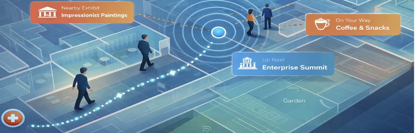
- What amenities and resources are at my disposal along the route?
By answering these questions clearly, you eliminate confusion and elevate the overall visitor experience.
1. Apply Basic Principles of Mapping and Navigation
Digital maps may be modern technology, but the core concepts of mapping and spatial navigation have been around for centuries. There is a lot your digital twin map can borrow from traditional practices. Intuitive digital wayfinding experiences start with understanding how the human brain processes spatial information.
The principles of communication that work in the physical world apply directly to digital interfaces. Consider the following:
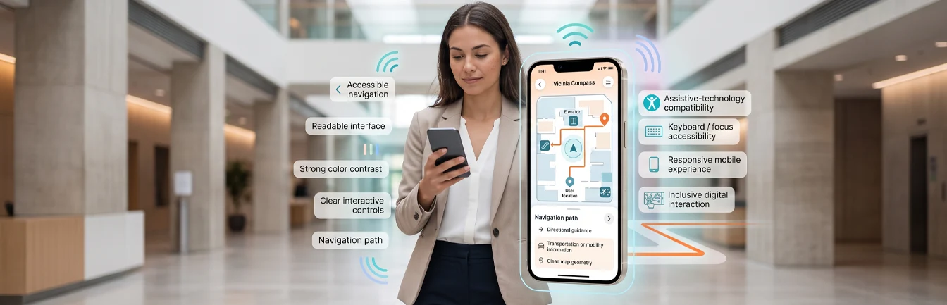
- Typography Matters: Font color and size are critical for readability and accessibility. For example, larger fonts, bold text, and italics can effectively highlight important information without cluttering the screen.
- Keep it Simple: Font styles must be clean and easy to read at a glance while remaining consistent with your brand kit.
- Visual Hierarchy: Color contrast establishes a visual hierarchy, making it easier for users to identify important information, distinct zones, and specific points of interest.
- Accessibility through Contrast: High contrast between text and the background makes the map easier to read, particularly for users with visual impairments or those viewing screens in brightly lit areas.
- Universal Symbols: Symbols and pictograms are a universal means of communication, bridging gaps in language or cultural background. Standardized icons for restrooms, elevators, cafeterias, exits, and information desks should be easily recognizable.
2. Maintain Consistent Branding Across Platforms
Your brand is unique to your organization, and your navigation solution must reflect that identity. This includes naming conventions, color palettes, and multimedia elements. Ultimately, you want the transition from your physical space to your digital map to feel continuous.
According to marketing research, the top 20% of consistent brands are significantly more successful at generating awareness, differentiation, and positive attitude changes among consumers.
Our platform enables you to easily color-code your maps to match your brand guidelines. You can also integrate multimedia content that reflects your unique brand voice. By doing so, users seamlessly interact with your brand identity throughout their digital journey.
3. Design an Intuitive Platform Journey
It is vital to get the user interface right from the first click. The digital mapping solution must meet user expectations, regardless of whether they are a tech-savvy expert or a digital novice.
An intuitive design enables users to quickly survey the map, clearly understand their routing options, and effortlessly decide where to go next. To build seamless digital wayfinding experiences, you should utilize built-in tools such as categorized menus, predictive search bars, and quick-link buttons for popular destinations. Minimizing the number of clicks required to find a route directly correlates with higher user satisfaction.
4. Build Accessible Digital Wayfinding Experiences
Accessibility refers to how users with varying abilities, specific needs, or preferences can successfully navigate your platform and, consequently, your building. The key to effective solution design is understanding how accessibility fits into the holistic user experience.
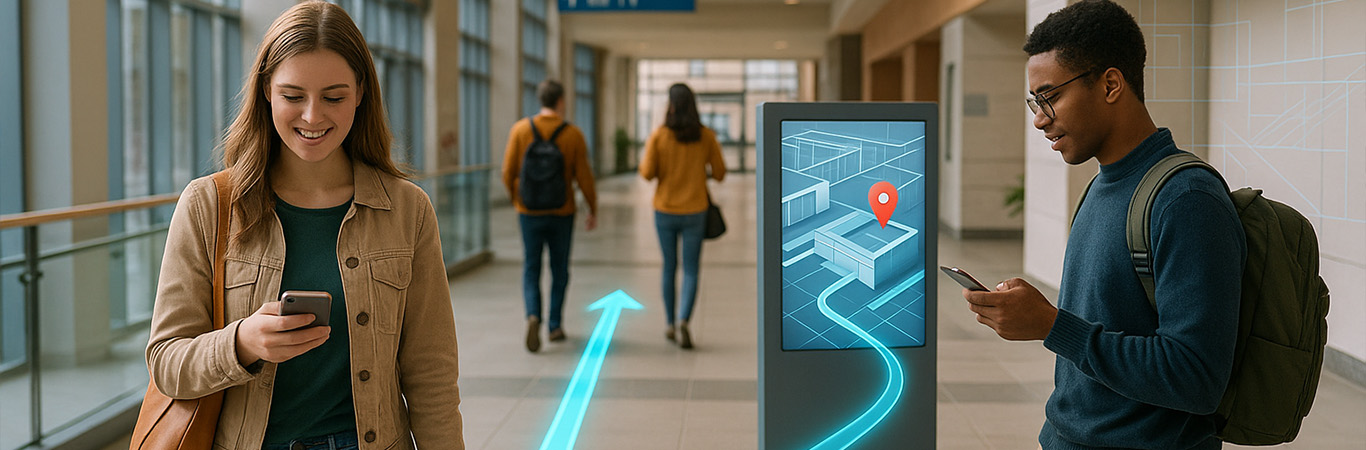
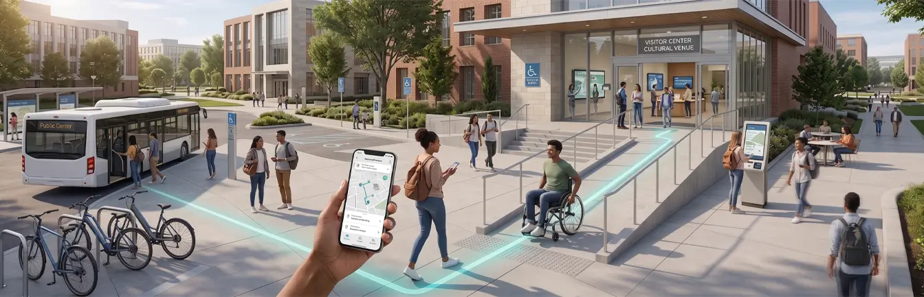
Your navigation tools must be available at key points in the visitor’s journey. This accessibility may be digital (accessed via mobile devices or web browsers before arriving) or physical (accessed via interactive information kiosks in the lobby). Furthermore, modern solutions often require additional features, such as voice prompts, screen reader compatibility, and wheelchair-friendly routing options, to provide a truly inclusive, hands-free experience.
5. Leverage Analytics for Continuous Improvement
The best digital wayfinding experiences are not static; they evolve based on actual user behavior. By leveraging the analytics dashboard within your navigation software, facility managers can track which routes are most popular, what search terms are frequently used, and where users tend to abandon their searches.
This data is invaluable. If analytics show that visitors are consistently searching for the location of a specific conference room or cafeteria, you can update the default map view to feature those locations more prominently. Continuous iteration based on real-time data ensures your design remains intuitive and directly aligned with what your visitors actually need.
Services and products are only as valuable as their usability. For more information on how to design and deploy intuitive navigation software that transforms your facility, contact us to book a demo today.